Before we get into the nitty gritty of these covers, I must say that Juan (not his real name) and his designer worked very hard on each and every design and I applaud their efforts. In fact, I had a hard time choosing.
The first one was my least favorite. At risk of sounding homophobic, I just found it simply too gay. Had the main character actually been gay (or an utter narcissist), it might have worked. (As soon as I can figure out how to convert a PDF to a JPEG or some other acceptable format, I'll show you a copy.) It was a man leaning against a mirror looking very sad.
The third one was just plain depressing. Washed in a sea-green tint, it showed a man seated at the bottom of a long outside stairwell with his head in his hands. (Again, you'll see a copy as soon as I figure out this tech stuff.)
I went with a modified version of the second iteration:

I think it captures the mood and the essence of the book rather nicely. However, when I saw some of the other covers on Brown Paper Publishing's website, I was actually a little jealous. I thought mine looked the least inviting. This one, for instance, simply looked more polished:

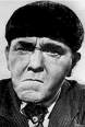
But Juan DeCarlo (not his real name) told me that he based the design of my book cover slightly on a classic novel by GK Chesterton:

So perhaps the old cliche is true: you truly cannot judge a book by its cover.